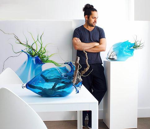
When it comes to art, there’s usually no right answer. When it comes to displaying art, however, there are some tried and true principles that can mean the difference between a truly exceptional sculpture display and leaving your valuable art in a less-than-flattering circumstance.

A few posts ago, we shared some tools for designing a pedestal for your piece at home. We decided to zoom out a little further and talk to the experts—curators and exhibit designers from some of our favorite galleries and museums—to find out more about displaying art at a pro level.
Whether you’re curating an art gallery or just looking to up your game when it comes to interior design, give this a read first.
Ask yourself, what story do I want to tell?
Lisa Hatchadoorian, executive director of the Fort Collins Museum of Art, explained that before designing a new exhibit, she considers how works of art interact and what story they will create in relation to one another and across the museum. To help foster this vision, she asks herself, “What story am I creating with the artwork? What do I want to say with this particular grouping of work and in what order do I want to say it?”
Lighting is crucial.
According to Hatchadoorian, in purely art exhibitions (as opposed to history or interactive exhibition) you want to use lighting to highlight the artwork to its fullest without calling attention to the lighting itself. The lighting has to be subtle and unassuming and vibrant, all at the same time. You have to make sure everything is smooth, no dark spots or hot spots on the work or the walls, no reflections, no halos, nothing that can distract from the work.


Consult the artist.
Often times the artist knows how their piece is best displayed and may have thoughts (or in some cases, requirements) for how best to display their artwork. They’ve spent more time than anyone looking at their piece and should be considered the expert when it comes to making big decisions about how it should look. Sage Sommer, the exhibition manager and registrar for SITE Sante Fe, always starts by collaborating with the artist and/or lender to come up with an art display solution that both fits the space and stays true to the vision of the artist.
Keep it clean.
If you don’t maintain your art display furniture and gallery, it can set the tone for the art itself. According to Sommer, a dirty, worn out or otherwise unkempt pedestal detracts from the piece it holds and can be very distracting for the viewer.

When possible, stay uniform.
When you have multiple pieces to display, it’s best to have a standard pedestal option that you try and stick to whenever possible. Dave Kerber of Taglialatella Galleries said that they use a uniform size and color (white) to keep the bases from standing out or becoming a distraction from the art itself.
Be practical.
Before ordering 18 new art display pedestals for a new exhibit or collection, know and understand the practical limitations of your space. Kerber said that at Taglialatella, their standard pedestals are all collapsible so that they can be easily stored in their limited space when not in use.
Size is important.
At the end of the day, it’s all about feel and the proper height and footprint are crucial. Too large a pedestal and the artwork will disappear, too small and safety becomes an issue. Generally speaking, you want a footprint at least 1.5″ larger than the base of the artwork itself, though this gets complicated when adding a turntable or lighting.
We’ve consulted on tens of thousands of art displays over the past decade, so give us a call. We can’t wait to talk about your art display!
Hatchadoorian summed up the advice in one simple sentence: Let the art do the talking, and get out of the way.


